Information Design
January – May 2022
-
All pieces made in my Information Design course. We tied together principles of design to present information in an efficient and affective layout. Three main projects are highlighted below. Each with an entirely unique set of data, and need for information display.
-
Each project began with research. What data is crucial to the graphic and what can be left out. Only to include the important data to not confuse the viewer and make each piece easier to navigate without clutter. Then there were numerous rounds of ideation and testing out ways to display the information. Some process is viewable below.
Timeline of the Jan 6th Capitol Riot
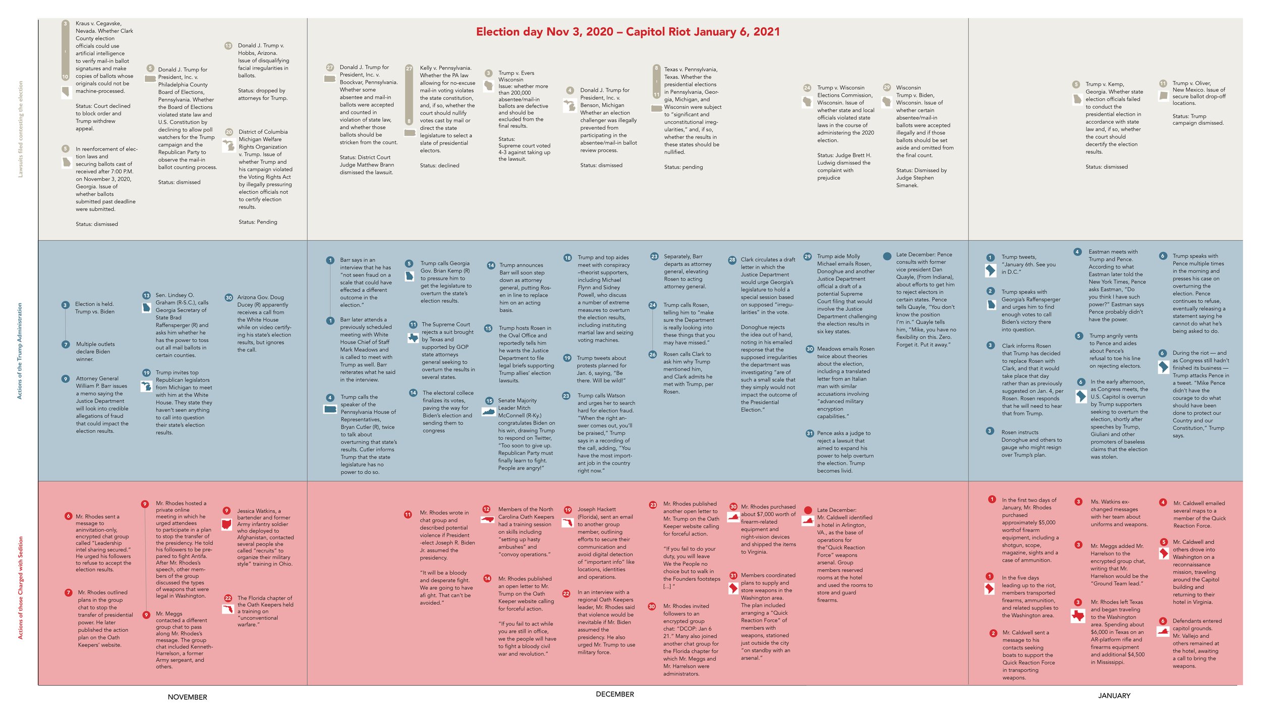
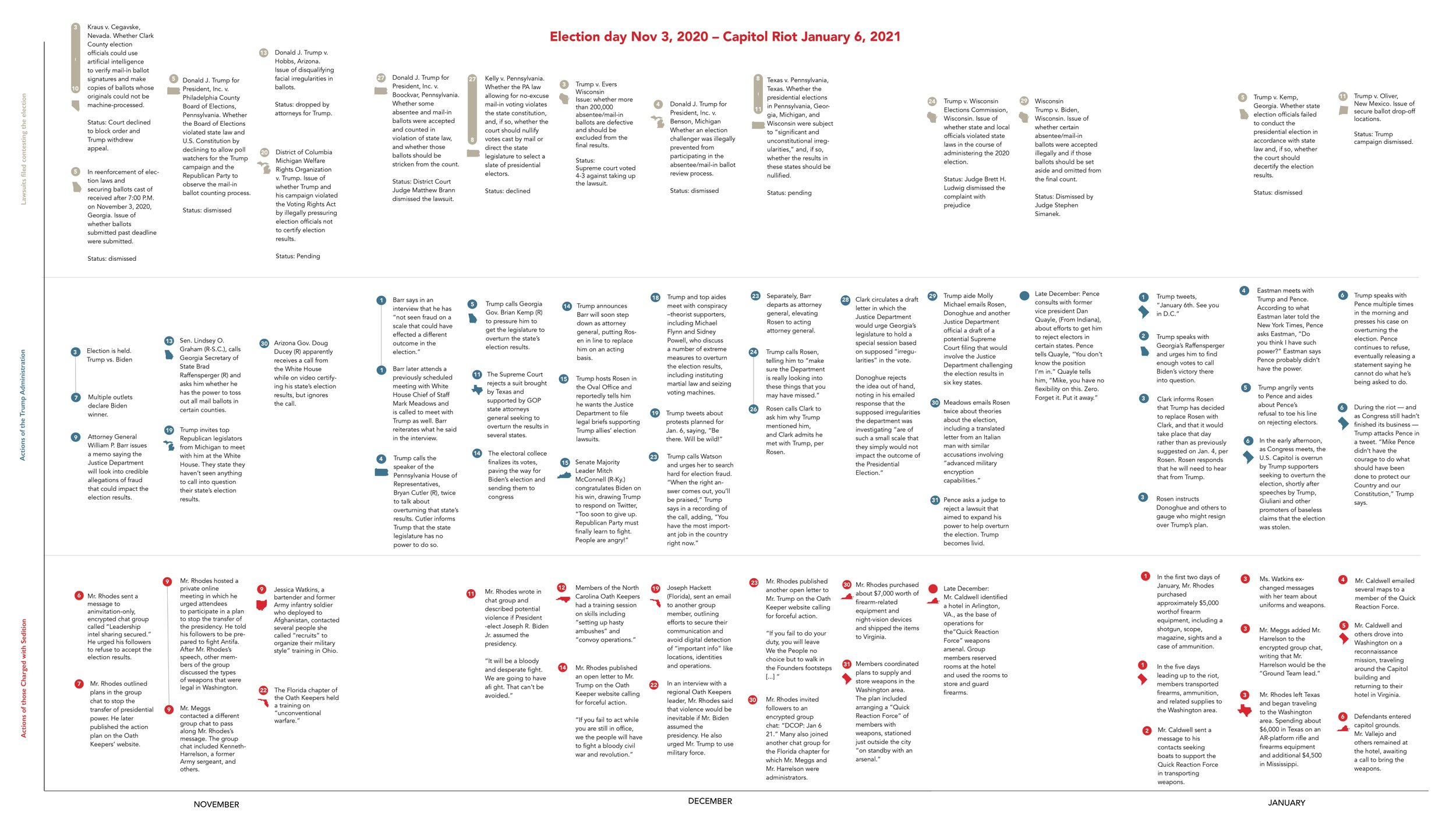
This informational diagram/map of events chronicled in three datasets: Actions of those charged with Sedition, Actions of the Trump administration and Lawsuits filed contesting the election. I was tasked with mapping time from these three parallel events. I chose to group the information by US state to see where most of the action was going on between each party. There are notable similarities between some of the actions of the Trump administration and the actions of the “Oath Keepers”, charged with sedition. Most of the action occurs in DC leading up to the date of the riot where it took place. Most of those charged with sedition were working remotely from southern states organizing the riot as soon as the election took place in November and all of their actions can be lined up and traced to the insurrection at the capitol.
Color Scheme:
Typefaces: Avenir, Gill Sans
Size: 24 x 36 in
Process:
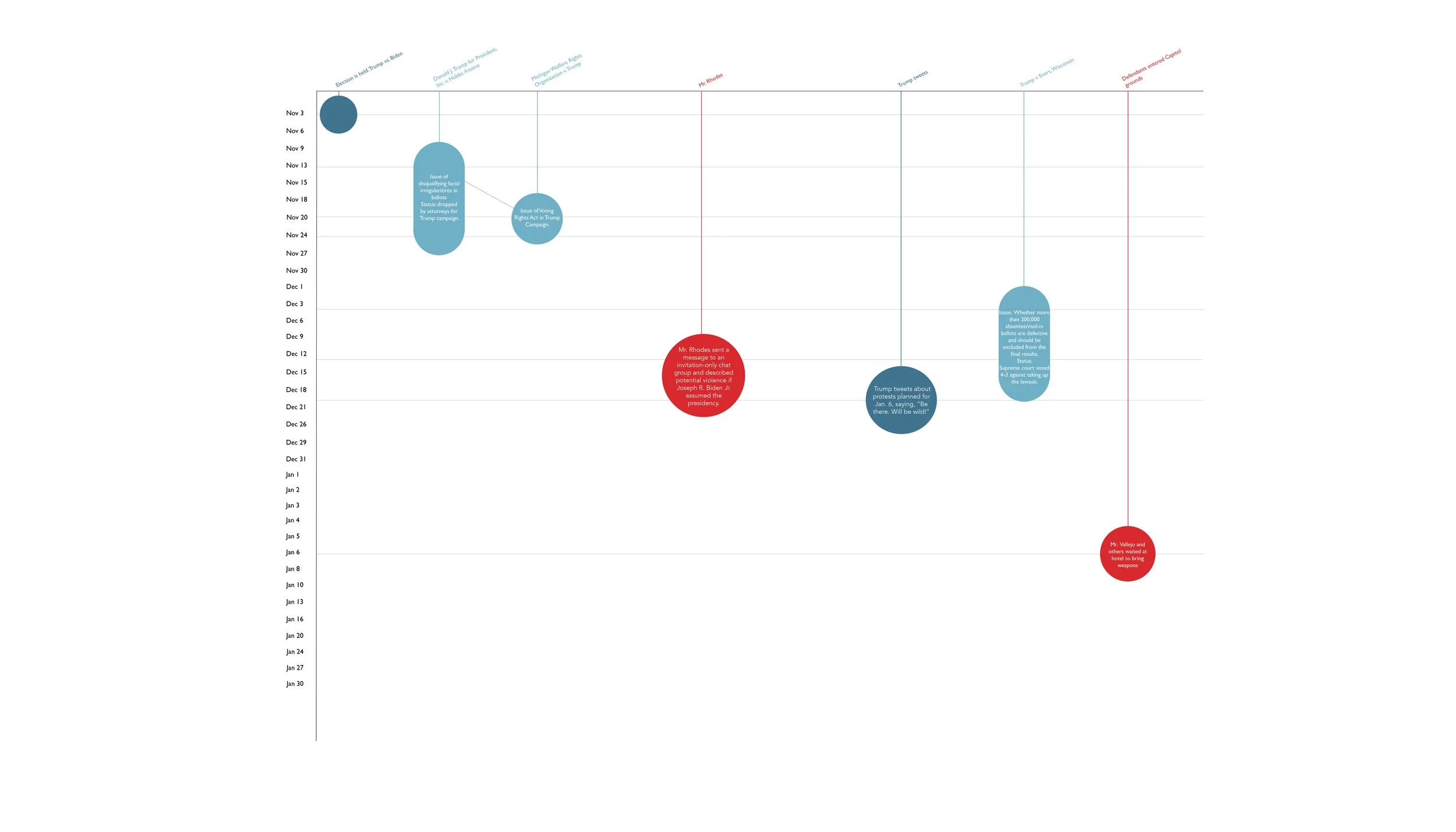


Creating and Mining an Archive
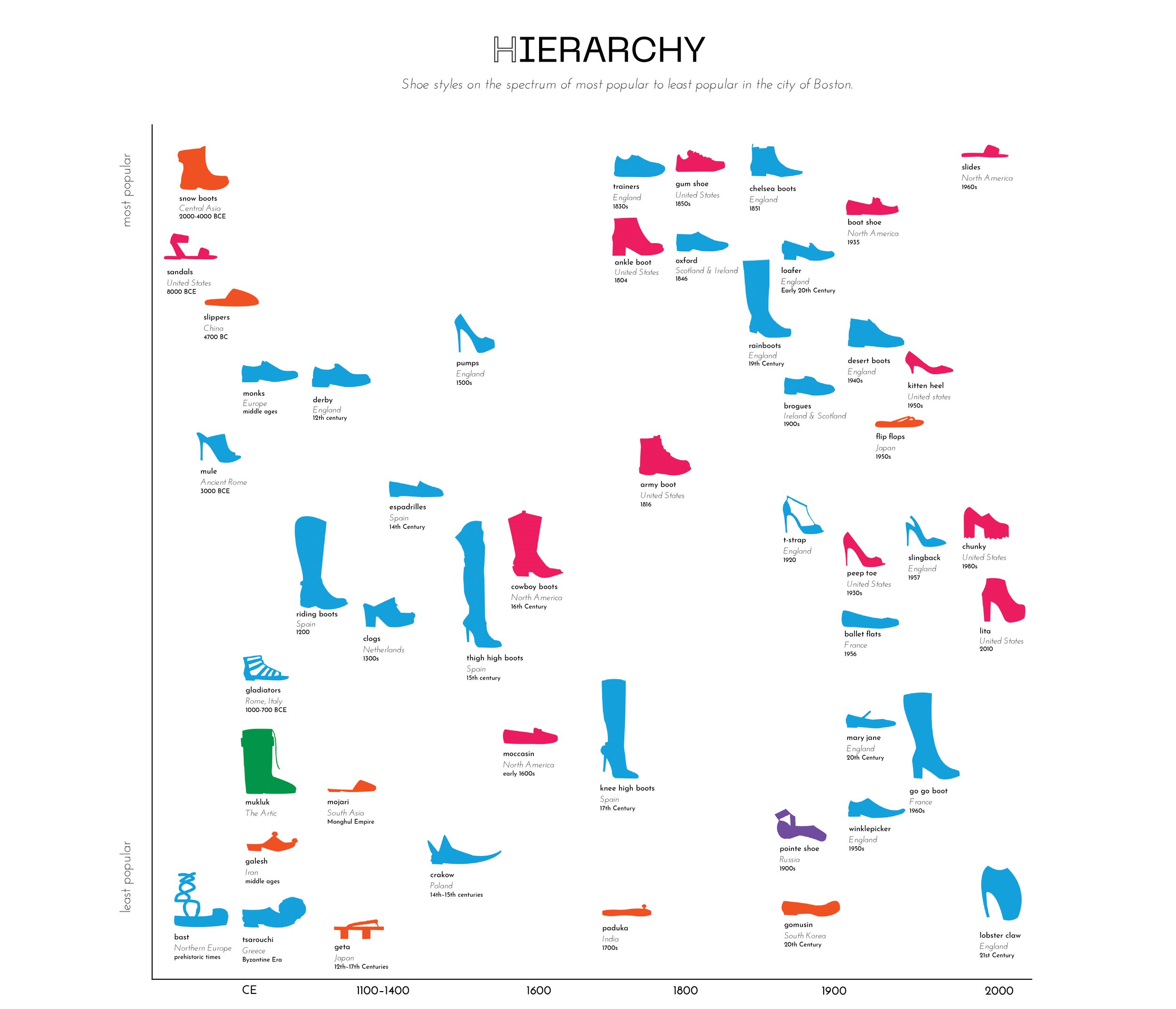
Task was to create an information diagram of a collection or archive assembled from an original collection I compiled. The purpose is to help viewers understand the scope and relatedness of shoe styles through their native country origin, the years in which they were made popular, and 4 variables. I made the variables based on the acronym SHOE. Season, Hierarchy, Occasion, and Edition. By grouping the information I found patterns and connections that help communicate the content. Audience is someone NOT already familiar with the collection. I used the technique of small multiples. I made each icon for each shoe in illustrator and translated it to a color to symboling its origin country. Then I made for graphs for each variable. You can trace one pair of shoe through each section to find similarities or differences. I aimed to choose shoes from a diverse amount of continents, and of various styles. Most popularly, shoe styles have come from Europe and North America. Macro information of each shoe is placed below its icon. This poster is rather long, but impactful when printed at its intended size. I hope that you learn something new about the shoes you have on your feet now.

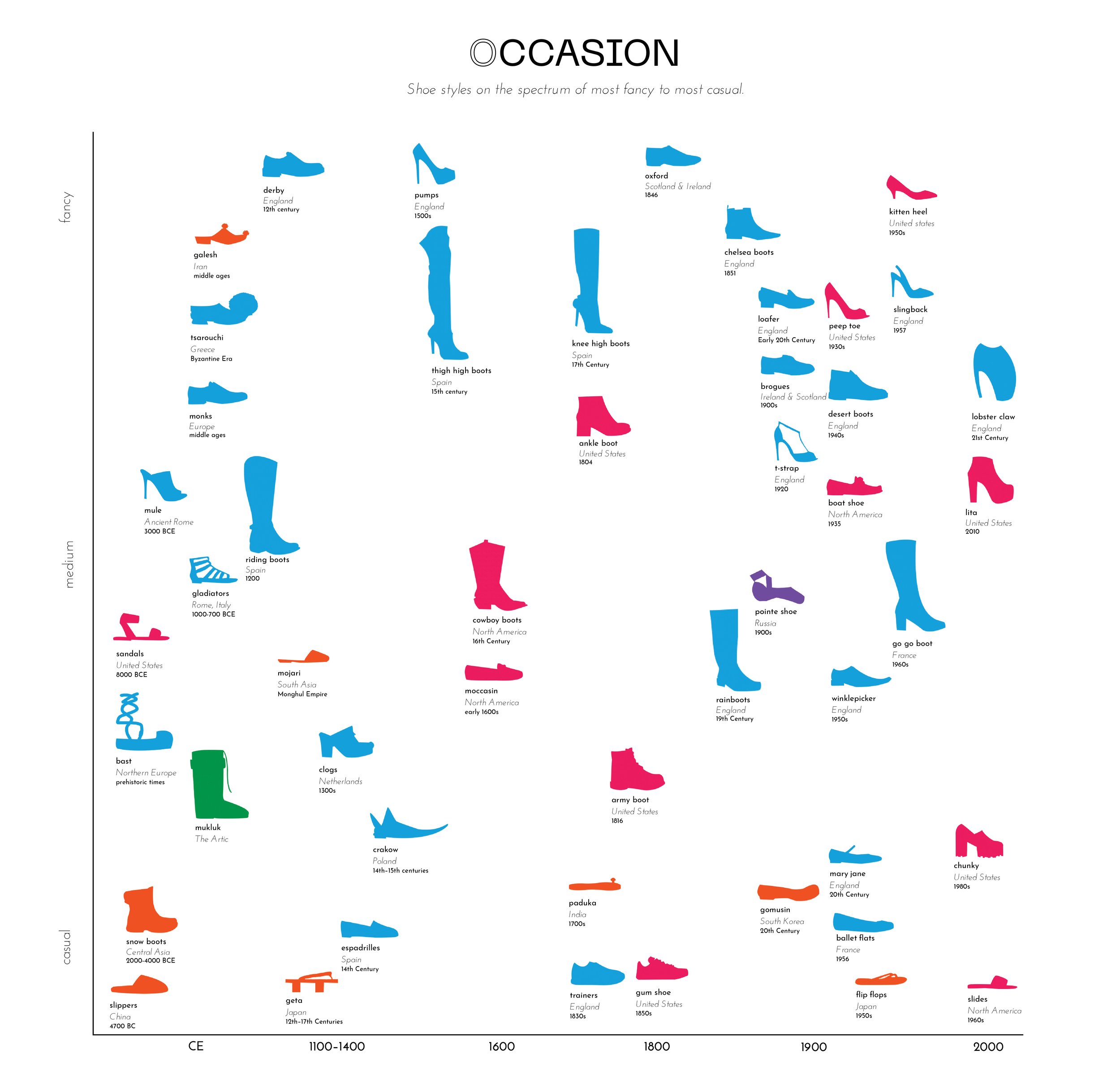
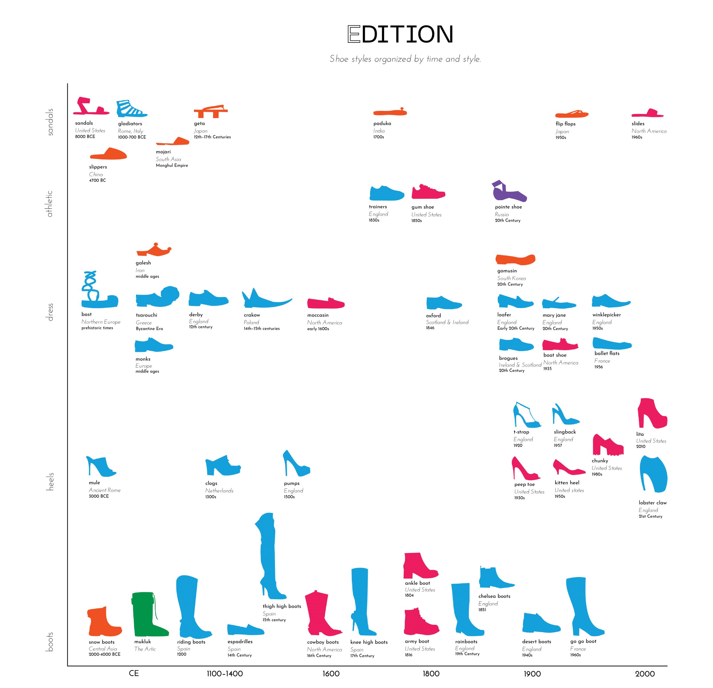
Color Scheme:
Typefaces: Neue Machina, Josefin Sans
Size: 20 x 90 in
Recipe Design
A series of 3 designs for 2 recipes. These are two quite different types of recipes to show how each recipe is translated into the templates. Hierarchy played an important role here. Elements I paid close attention to were the times that it took to perform each step and the ingredients used. I decided the best way to display the information. In two designs, the type is all in one family and treatment to really focus on the information at hand. The design with the pie charts features different weights, shades, and italics to emphasize crucial steps that are not to be missed, in a more visual sense


